
Safety in plain sight: Visual cues build better habits
SAFETY CULTURE is not built only in training rooms, policy documents or quarterly meetings. It is shaped in the small moments people experience every day: reaching for the right equipment, noticing a spill, checking a machine, storing materials correctly, or pausing before entering a restricted area.
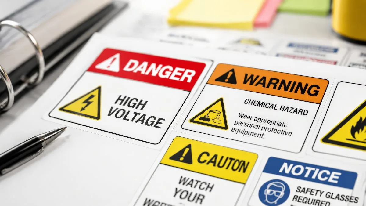
That is where visual cues earn their place. Clear signs, labels, floor markings, posters and colour-coded prompts make safe choices easier to spot and quicker to act on. Used well, they turn safety from something people are told about into something they can see, understand and use.
Why small signals shape big habits
A strong safety culture depends on consistency. If the workplace says one thing in training but looks chaotic in practice, people receive mixed messages. Visual cues help close that gap by reinforcing the behaviours a business wants to see.
The Health and Safety Executive’s workplace safety signs guidance is a useful reference for understanding when signs are needed, particularly where a significant risk cannot be avoided or controlled in another way. That matters because safety signs work best when they are purposeful, clear and placed where they genuinely help people make better decisions.
Make safety visible at the point of action
The best visual cues are positioned where decisions happen. A poster in a break room can raise awareness, but a reminder beside the equipment, entrance, storage shelf or workstation is more likely to influence behaviour in the moment.
Think about the difference between a generic “stay safe” message and a clear prompt that says what to do next. “Wear eye protection beyond this point” works because it is direct, timely and practical. Colour-coded storage labels can prevent mix-ups. Floor markings can guide movement around vehicles or machinery. Inspection stickers can show at a glance whether equipment is ready to use.
Visual communication should also support people with different levels of experience, language confidence or familiarity with a site. The IOSH guide to getting workplace messages across is worth reading for its practical advice on making communication clearer, including the role visual elements can play in helping people understand important health and safety information.
Keep it clear, not cluttered
More visuals do not automatically mean better safety. Too many signs, competing colours or vague messages can fade into the background. A useful approach is to audit the workplace through the eyes of someone new. What would they understand instantly? Where would they hesitate? Which areas feel unclear?
Effective cues are simple, specific and consistent. Use plain language. Keep icons recognisable. Match colours and formats across departments. Replace damaged, outdated or faded materials before they lose credibility. If a sign looks ignored, people may assume the message is ignored too.
This principle applies beyond formal safety signage. Product, packaging and operational labels can also influence trust and clarity. For customer-facing businesses, effective label printing can help businesses improve product presentation, but internally, the same attention to detail can make instructions, warnings and processes feel more professional and easier to follow.
Build culture through repetition
A single sign will not create a safety culture by itself. But repeated, thoughtful visual cues can help make safe behaviour feel normal. They remind people what matters, reduce the chance of avoidable mistakes and show that safety is part of everyday work, not an occasional campaign.
When visual communication is clear, practical and well maintained, it quietly does something powerful. It helps people make better choices without slowing them down.
HSM Newsletter
HSM publishes a weekly eNewsletter, delivering a carefully chosen selection of the latest stories straight to your inbox.
Subscribe here